CASE STUDY – HIPCHIPS
packaging design | photography
Overview
Hipchips are an artisan crisp producer who, after successfully selling within their own store in London, were branching out into the major supermarkets.
The boxes they had been using were perfect for their own store but impractical for supermarket shelves so they needed whole new packaging solutions whilst keeping within their brand guidelines.
Solution
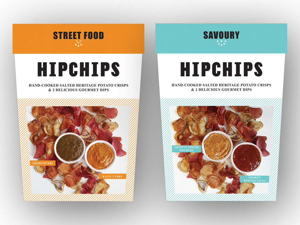
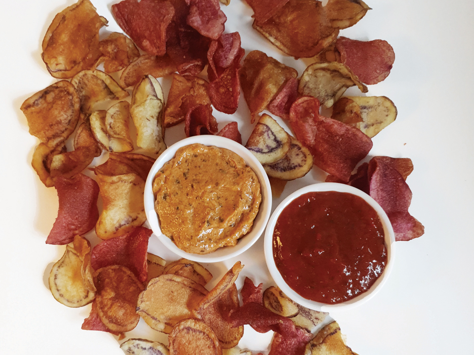
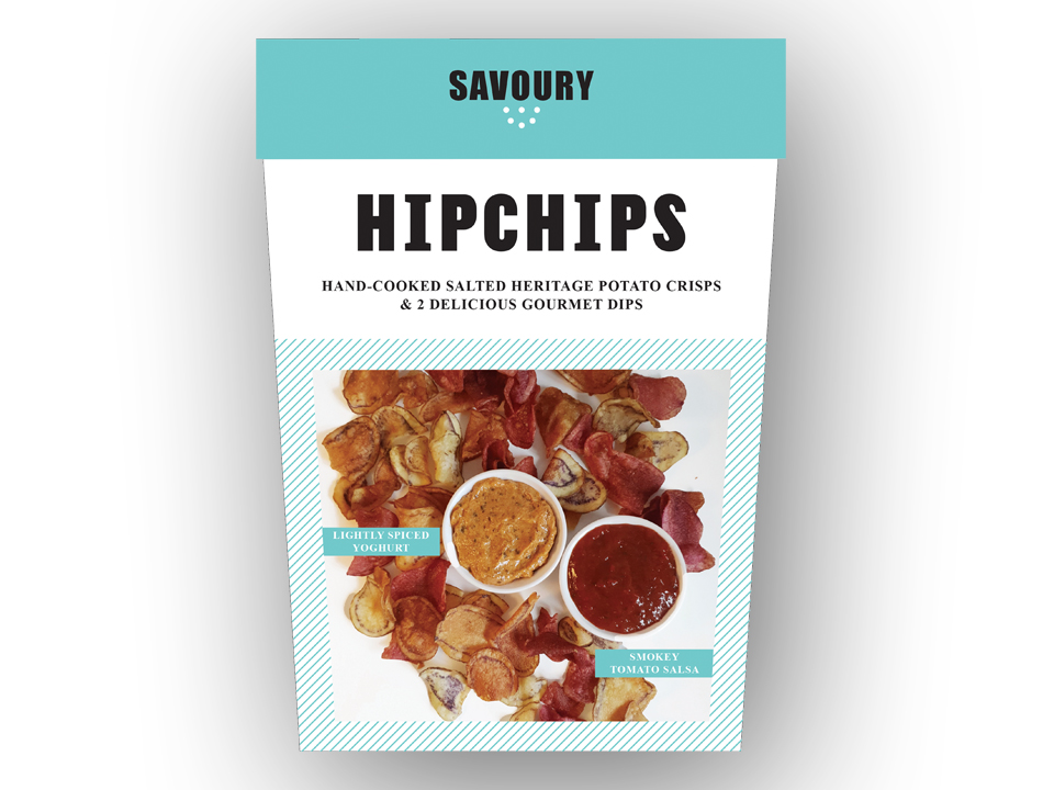
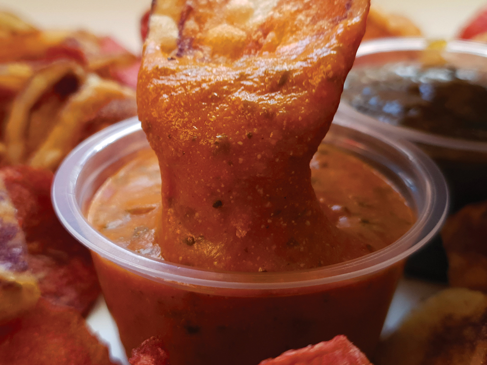
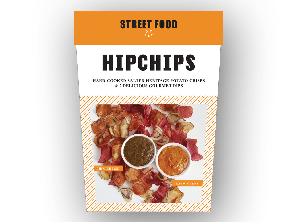
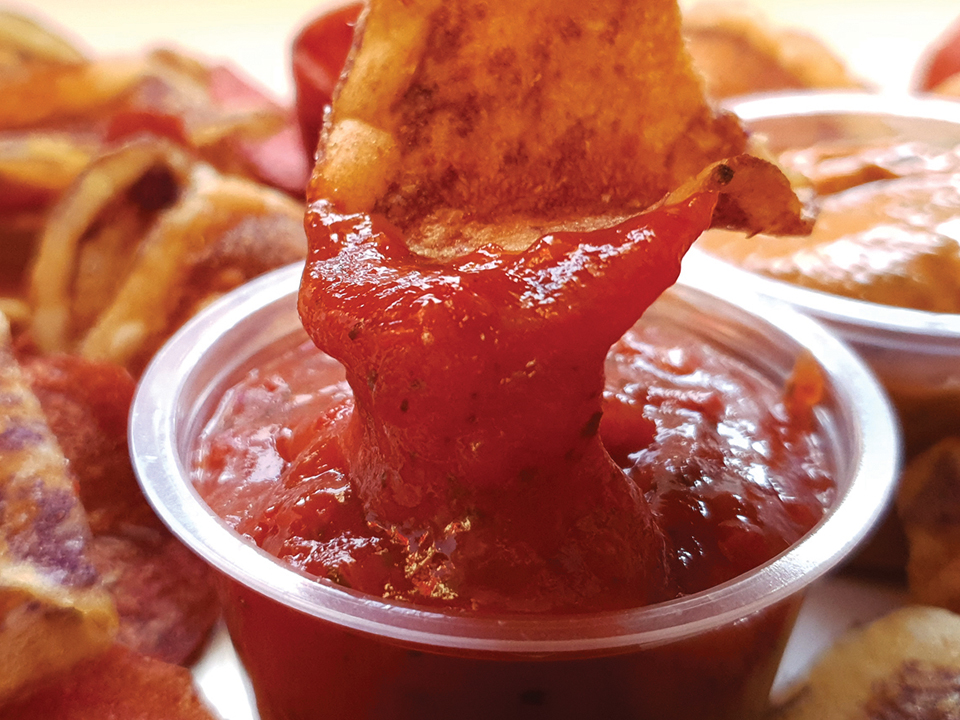
We worked closely with Sainsbury’s after Hipchip agreed a deal to place the new product in their stores nationwide. The new boxes needed to be a more compact shape so we opted for the cinema popcorn style box but with a lid. This would give great shelf appeal as well as take up less space (which we all know is premium in supermarkets!). The original boxes also had no product photography which is vital in a supermarket help customers choose the product but also to stop customers opening the boxes to see what’s inside.
The photography had to “show” the taste of the product by looking visually appealing and then these photographs had to take centre stage on the packaging itself.

Outcome
After many discussions with Sainsbury’s over the photography we decided the plain white backgrounds worked the best as these showed up the product well along with being eyecatching for the customers. We knew the customers buying habits so we had to show them these were premium crisps from the outset.
The finished boxes are classy but modern, exactly like the target customer, and the photography is sumptuous and mouthwatering. We complimented the packaging with SRP (shelf ready packagaing) outers so the products could be easily placed on the shelves as well as stay neat and tidy.
HOME
VIRTUAL COFFEE
MY DESIGN WORK
CONTACT
5% of sales are donated to

Actively reducing my carbon footprint by using 100% renewable, vegan electricity
![]()
![]()
© 2024 Sara Truckel
Trading as Truckel Creative